Iterating on design for code blocks
While writing the previous post, I stumbled upon an issue. The code blocks in the post were difficult to read on narrow screens (i.e. smartphones) due to long lines.
When a code block scrolls too much horizontally, I tend to disengage with it completely. So I was wondering: how could I avoid that?
This has led me to rethink a bit how I display code blocks on this blog, and this short post is a summary of my experiments.
Images are a no-go
I really dislike the concept of using images as a substitute for proper code blocks.
Ignoring accessibility concerns, I don’t like that I can’t select the text inside them. They’re also often filled with tons of unnecessary padding that would be better spent on actually showing me the source code.
One trick I’ve seen on a post that was shared on Lobsters is to use embedded SVG images. It works, but I feel like the varying font size can look a bit jarring, and sometimes gets too small to be readable. I’m also not sure about how well it fares in terms of accessibility.
So, for my own blog, I’ve decided to go with something else.
The experiment
Lo and behold, here is the result:
void read(Reader& reader, Value record, Window_Config& config)
{
	Value key, value;
	while (de::record_pair(reader, record, key, value)) {
		if (key == "size") get(value, config.size);
		if (key == "is_maximized") get(value, config.is_maximized);
		if (key == "is_fullscreen") get(value, config.is_fullscreen);
	}
}
I know what you’ll say. “But riki, I’m on a smartphone, and this example scrolls.”
I know. It does!
But compare it to what you get in a GitHub readme, which is pretty exemplary of what most website designs do:
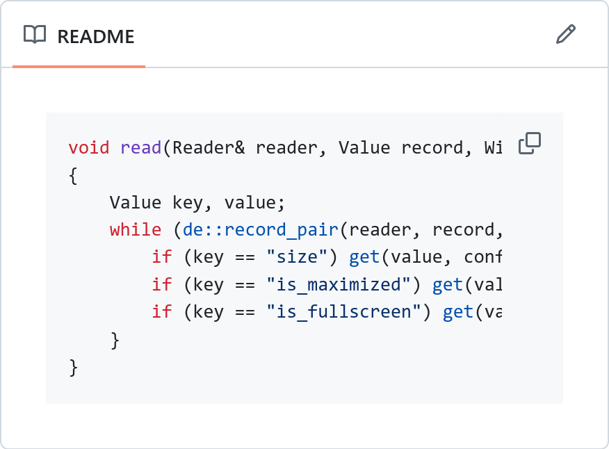
I feel like there’s a pretty clear difference in amount of wasted screen space here.
Typographic tweaks
First and foremost, the fonts used.
My blog uses Recursive for all the text. It is a variable font which includes a monospace axis, which decides how monospace the text should be. You usually only set to 0 or 1, and use the rest of the range for animation; but interesting things happen if you set the value to something in between and keep it that way.
You get something that resembles a monospace font, with much larger tracking, but still proportional, saving precious screen space.
To me personally, it actually looks quite pleasing. See for yourself how much scroll space can be saved by using a proportional font (upper), compared to a monospaced one (lower):
void read(Reader& reader, Value record, Window_Config& config)
{
	Value key, value;
	while (de::record_pair(reader, record, key, value)) {
		if (key == "size") get(value, config.size);
		if (key == "is_maximized") get(value, config.is_maximized);
		if (key == "is_fullscreen") get(value, config.is_fullscreen);
	}
}
A fully proportional version is even more compact, but I don’t think the visual separation between body text and code is clear enough in its case. It actually kind of looks like a font failed to load here, if you ask me.
void read(Reader& reader, Value record, Window_Config& config)
{
	Value key, value;
	while (de::record_pair(reader, record, key, value)) {
		if (key == "size") get(value, config.size);
		if (key == "is_maximized") get(value, config.is_maximized);
		if (key == "is_fullscreen") get(value, config.is_fullscreen);
	}
}
With how symbol-heavy programming languages are, I think the lack of extra spacing around punctuation hurts readability a lot.
Another thing I did was to lower the text size just a bit compared to body text. The way you scan through code is different to how you read sentences, so I thought lowering the font size just a tiny bit wouldn’t really hurt readability, and would gain some valuable screen real estate.
On desktop displays, the font size is 95% the size of body text.
On very narrow displays, I shrink the font size even further to 90%. This makes the text a bit jarringly small though, so to make up for the reduction in size, I bump up the font’s weight to compensate.
Tabs > spaces
Another typographic trick I pulled was to use tabs for indentation.
Now, I know what you’re thinking. “But riki, I don’t like tabs!”
Or, the “appeal to authority” version:
“But riki, the official Rust style guide mandates spaces instead of tabs!”
But in case of code blocks on a website, tabs have a pretty clear practical advantage over spaces: you can scale them down with screen size.
On narrow screens, I make tabs have a smaller width than on wide screens, therefore saving some extra space. Neat tech, isn’t it?
You can control tab width from CSS using the tab-size property.
If you’re using a proportional font for your code blocks and are feeling extra fancy, you can even make it scale with viewport width by using vw units.
I chose not to do that for now, but might change that in the future.
Currently, on wide screens my website uses tab size 3, and on narrow screens it uses tab size 2.
Here’s a deeply nesting function to demonstrate this.
static void load_cue_table(Reader& r, Value record, Demo_Player& d)
{
	Value key, value;
	while (de::record_pair(r, record, key, value)) {
		if (key == "cues" && value.type == Value_Type::record) {
			Value v_tick, v_offset;
			int i = 0;
			while (i < d.cues_num && de::record_pair(r, value, v_tick, v_offset)) {
				Demo_Cue cue;
				de::get(v_tick, cue.tick);
				de::get(v_offset, cue.offset);

				if (cue.offset >= 0 && cue.offset < d.len) {
					d.cues[i++] = cue;
				} else {
					logs::write(log_error, "load: cue {} has invalid offset: {}", i, cue.offset);
				}
			}
			d.cues_num = i;
		}
		if (key == "duration") de::get(value, d.duration);
	}
}
Stretch
Last but not least, on narrow displays my CSS turns code blocks extra compact by making them stretch to the entire display width. This mimics what Bob Nystrom does in the online version of Crafting Interpreters (example), although his version prefers to leave a bit of space on the left and the right for the white website background.
// This is an example code block to demonstrate this.
// Come on, shrink your window!
// Or don't, if you're on your phone already.
On both my website and in the web version of Crafting Interpreters, what happens is that code blocks start lining up with body text, getting rid of any extra padding on the left.
There’s still clear visual separation through borders (in light mode) and background colour (in dark mode), so it’s easy to spot where a code example begins and ends.
And I think this last trick really helps bring the whole typographic experience together. Doing that not only fits more code on the screen, but also makes the design feel more intentional and polished. Like your website belongs on narrow screens—rather than their support being an afterthought.