Spot(the user hostil)ify
this page is dedicated to pointing out stupid design flaws in Spotify’s user experience.
2024-04-17 as a paying customer I’d expect it to be better but I guess they’re just not making enough money. what a poor, small company they are to be having these problems :(
2024-04-17 “well then why are you paying them, riki?” unfortunately lots of music is only available (and UNAVAILABLE!) on Spotify, as seen on fuck DRM. from a consumer standpoint it’s also really nice for discovering new music, because you don’t have to pay a large amount just to give a listen to an album you may not end up liking.
2024-04-17
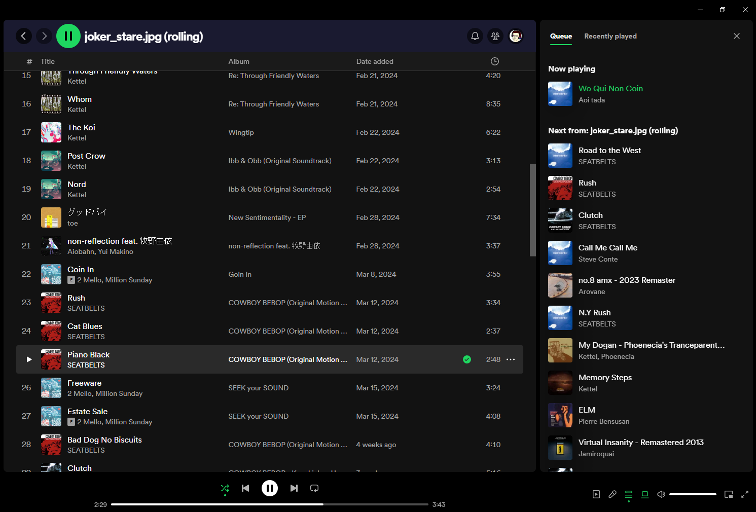
 a couple days ago I’ve noticed the queue in the desktop app has changed…
2024-04-17 while I do appreciate the fact that you can open the queue next to your playlist, which allows you to see more information at a time, there is one very serious problem which unfortunately I cannot illustrate very well with a screenshot (at least as I’m typing this right now).
I’ll try my best though.
2024-04-17 if you hover over any part of the row, you get the pointer rather than default cursor, which suggests that clicking is gonna result in an action being taken immediately - except that’s not what happens. instead, if you click on the blank part, the element is only gonna get selected - as it used to in the old queue, which is good. but if that’s what happens, that’s definitely not the cursor to use.
2024-04-17 this threw me off the first time I saw the new panel, because I thought it was a downgrade in terms of functionality. “what, I can’t select many items in the queue now to delete them?”, I thought, but no. that is still possible; the mouse cursor is just confusing.
2024-04-17 I should probably do a writeup of textures given off by various cursors and other UI interactions someday.EDIT: done2024-04-17